
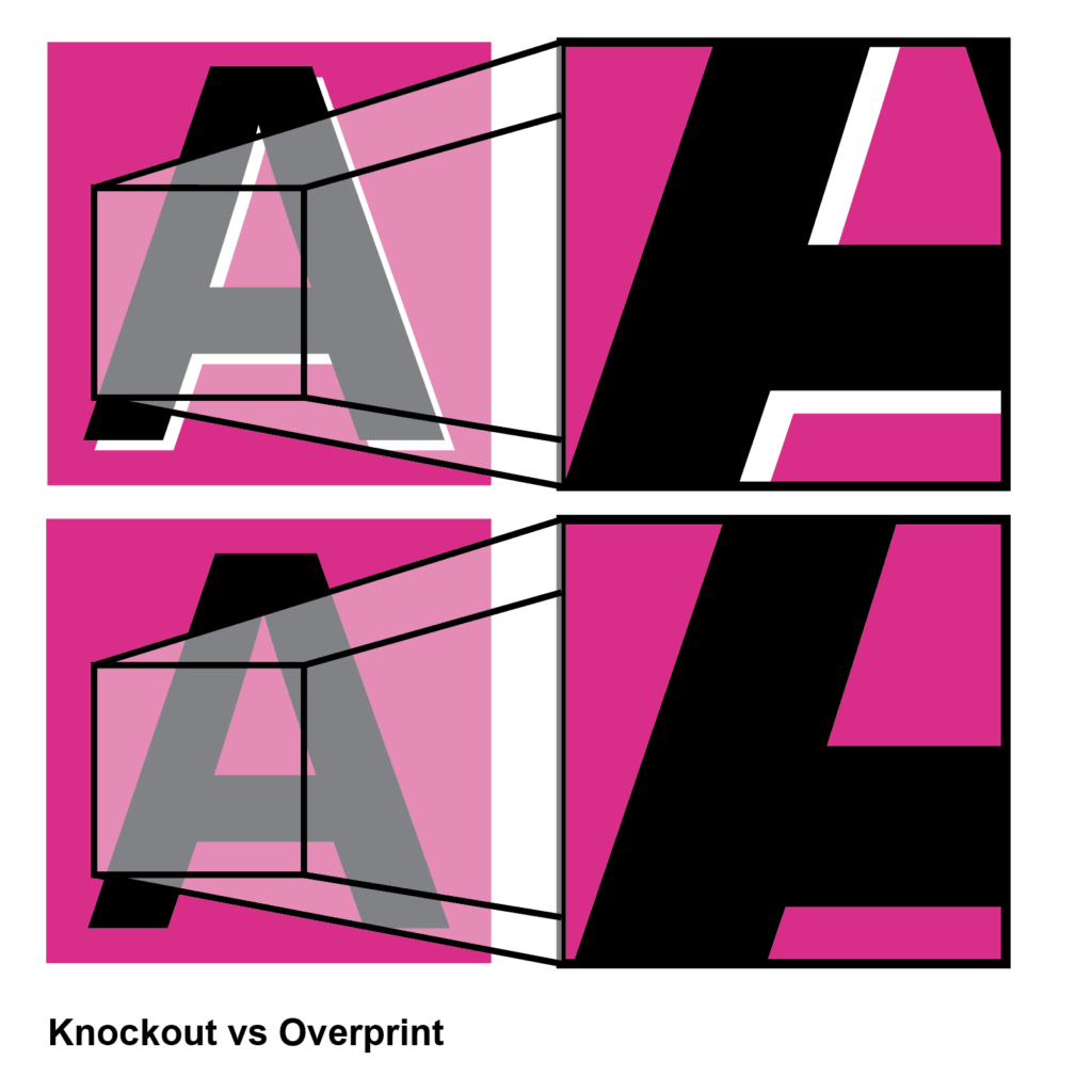
In the top image, the “A” is knocked out, but a bit misregistered.
In the bottom image, it’s overprinted.
With black letters, it makes sense to overprint rather than knocking out the space in the background. The magenta under the black simply makes the color deeper, and the area around it is even and has no issues with gaps of white space showing.