
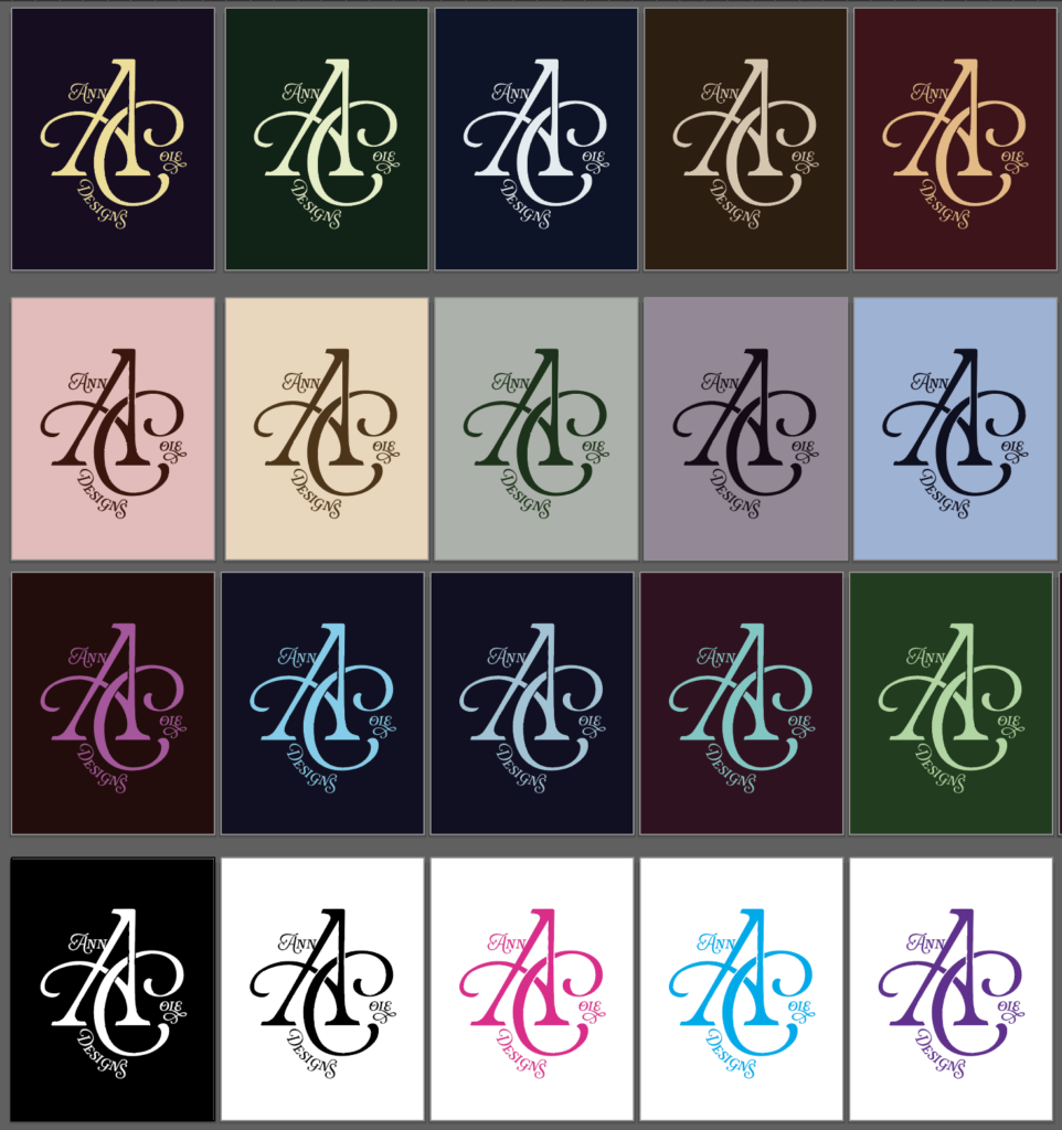
Here’s a selection of different color ways for my new personal logo!
When I designed this, I took inspiration from classic monograms, high fashion logos, and things from my own personal archives and memories. I wanted something that would look good on a webpage and business card, but would also look at home on custom-printed fabric for a chic handbag or silk scarf.
I didn’t know what I wanted to do as far as colors, so I mocked up multiple versions of the logo to see different combinations. Because the design is flat and only needs two colors, it’s very easy to do many variations on it. I even enjoyed seeing all of these side-by-side and could imagine a bunch of buttons printed with different colors– similar to the way the Metropolitan Museum of Art used to give guests different color admission tags on different days.
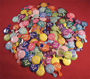
Image source: https://www.worthpoint.com/worthopedia/lot-180-1990s-2000s-metropolitan-1860545340
I also like how this logo is a subtle throwback to this signature I found on an essay I found from the late 1860s in my grandparents’ attic:
This essay is so old that it references the work of Charles Dickens as popular contemporary writer. It literally opens with, “Few if any of the novelists of the present time possess the ability to please their readers as does Chas. Dickens.”
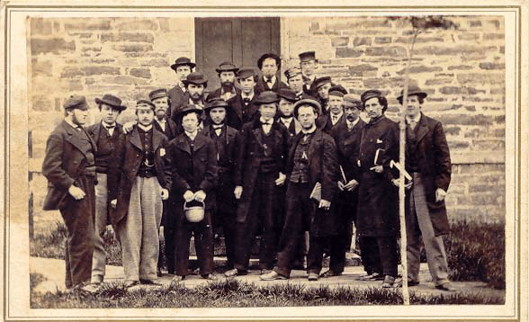
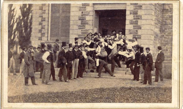
Edgar’s class photos looked like this:
And yet that signature still looks good enough that when I came across the Rafaela font, my instinct was to design a personal logo that has echos of that same style. There is absolutely no expiration date whatsoever on truly good taste.
Edgar also had impeccable fashion sense– somehow in the 2000s, there was still a 19th century family ledger in the living room that recorded the family spending $100 on his wardrobe (about $2,146 in 2025).
I have a pair of blue sunglasses that were his– they were so classic that no one ever got rid of them. The most obnoxiously fashion-conscious people I knew in NYC were impressed with these.

It’s like… these could be from “Dracula,” but they also look like John Lennon wore them while writing psychedelic music.
I’ve noticed some similarities between how I write and how Edgar wrote. I write things like “AI gives us access to the collective subconscious,” and Edgar wrote this about the telegraph machine:
“And who does not feel that the first clicking voice of the telegraph was sublime. As the electric fluid flashed along the wire, and wrote itself in dots and dashes on the recorder, upon the minds and hearts of the citizens of Baltimore not only, but upon the hearts of the nation, were written the impressive words of that young lady at Washington, ‘What hath God wrought.'”
Edgar died at age 19, when he was a junior at Hamilton College. His cousin inherited the family farm, and my family has been there every since. His entire legacy and mythos for over 150 years has been in the form of writings he left, beautifully styled photos, flawless handwriting, and the things people wrote about him. The most intensely romantic poem I’ve ever read was something Edgar’s classmate wrote about him after he died (and for the record, Hamilton College was men-only at the time…)
I hope that in 150 years, people will look at my logo the same way I look at Edgar’s signature and think, “I want that, but updated.”