
The best way to describe how I felt after getting all of this together is, “I’m so exhausted that gravity feels stronger right now.” That’s the effect of weeks of adrenaline, caffeine abuse, and reckless disregard for the limitations of time finally wearing off. At one point Patrick asked if I needed anything and I jokingly requested “a time-turning device” from Harry Potter.
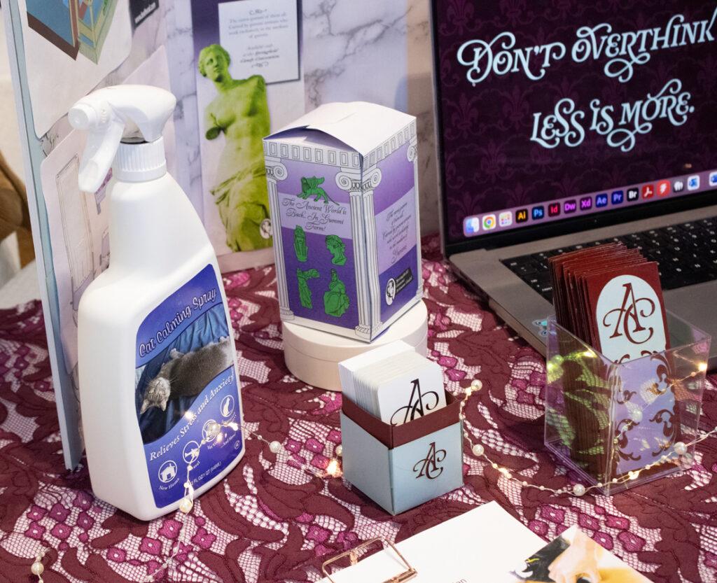
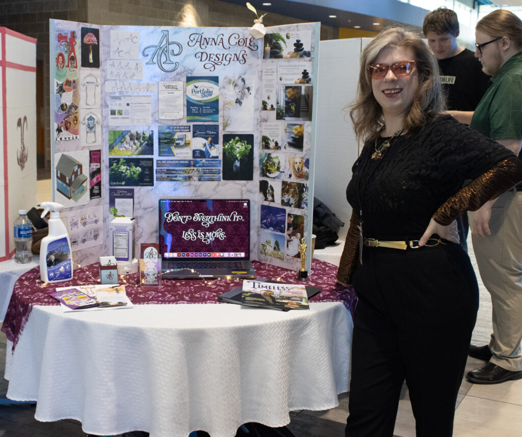
Here we have Scarlet modeling for a product label, a laser-cut box and bookmarks with matching business cards, and a tribute to a 1994 episode of “The Simpsons” in package design and advertisement form. The lace cloth came from Fabscrap in Brooklyn. It just happened to fit the burgundy and ice blue color scheme I picked for my personal branding!
The wallpaper on the computer says “Don’t overthink it” because graphic design is a bit like improvisational acting– 99% of the time, the most obvious choice is the one that will land best with an audience.
It’s not about trying to be super obscure and intentionally smart, it’s about making intuitive choices that are understandable to everyone. In one improv workshop I did years ago, the instructor talked about how “if you pick something obvious to joke about, the audience will think you’re a genius who is reading their minds.” We then did an exercise where we imitate “the worst doctor in the world,” but the assignment wasn’t really to pick the worst one– it was to do an impression of whatever came to mind first with the word “doctor.” I did an impression of Beaker from “The Muppets”– no words, just “mi mi mi mi mi” and positioning my lower lip to move like his. It didn’t take any deep thinking to be funny!
Advertising and graphic design is similar. Obvious or seemingly “unoriginal” choices are that way because they work. I think that’s part of why I was drawn to doing Simpsons homages for some assignments– classic Simpsons episodes riffed on stereotypes of American middle class life while also subverting them. It’s smart partially because so many of the jokes are very obvious. They’re also deeply relatable.

I sometimes think of that mushroom as “the graphic reduction that started it all.”
I did that late in 2023, only a matter of weeks after I had “detached with love” in Al-Anon Family and Friend Group terms from a close friend and business associate who was originally doing the marketing, graphic design, and web design for my art project Out of Lockstep. Part of why I hesitated so long to cut her off was simply not knowing the necessary skill set she had and not knowing where I would even begin to look for a replacement for that. I had almost no start up money and had just moved halfway across the country a few months earlier.
Less than a year after I drew that mushroom in Illustrator, I was displaying an 8 foot tall mural I had designed in Illustrator at a huge festival in New Hampshire.
And the David Bowie infographic? That was my favorite project to work on because it was a way to tell Bowie’s entire life story of various personas, musical styles and constant re-invention in an unconventional format.
I used to live in the same neighborhood as David Bowie– he lived on Lafayette St in the Lower East Side, and I lived on Orchard Street. There was a very specific magic to that part of the city– it felt like anything was possible and every day life was a performance art piece.
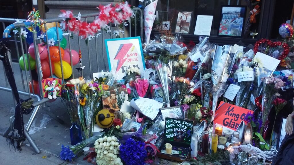
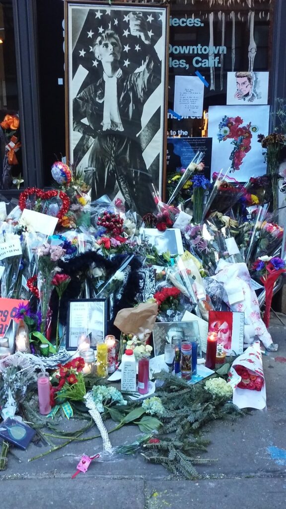
I was on a film set when I found out that David Bowie had died. The news was so seismic that a production assistant stopped everything to announce what had happened. Initially, everyone was in shock, but in the weeks that followed, the entire city became a huge festival honoring his legacy. Bowie fans gathered outside his apartment in the Lower East Side and left flowers and various other offerings day after day.
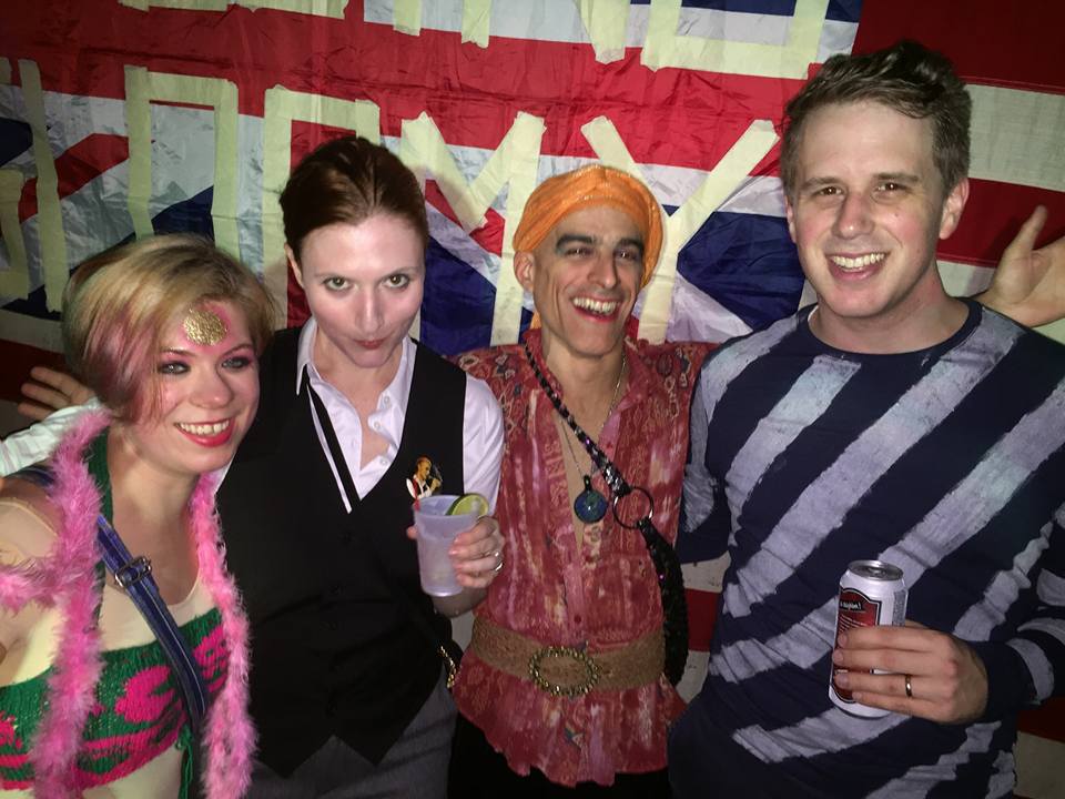
Every single night that week, there were tributes to David Bowie somewhere in the city. House of Yes in Bushwick had multiple dance parties where they played his discography, and they did “Rocky Horror” type showings of his films with audience participation and shadow casts. Gemini and Scorpio in Gowanus showed “The Man who Fell to Earth” in one long, surreal screening. Burning Man camps that were based in NYC took over karaoke bars to sing his songs. I can’t even keep track of the number of clubs that did a David Bowie night at some point in early 2016. Everywhere I went, people were dressing like his different personas.
Every Bowie fan in the city came together to transmute their grief and shock into a spontaneous festival that was equal parts reverence and debauchery. That experience defined what it meant to live there in the 2010s.
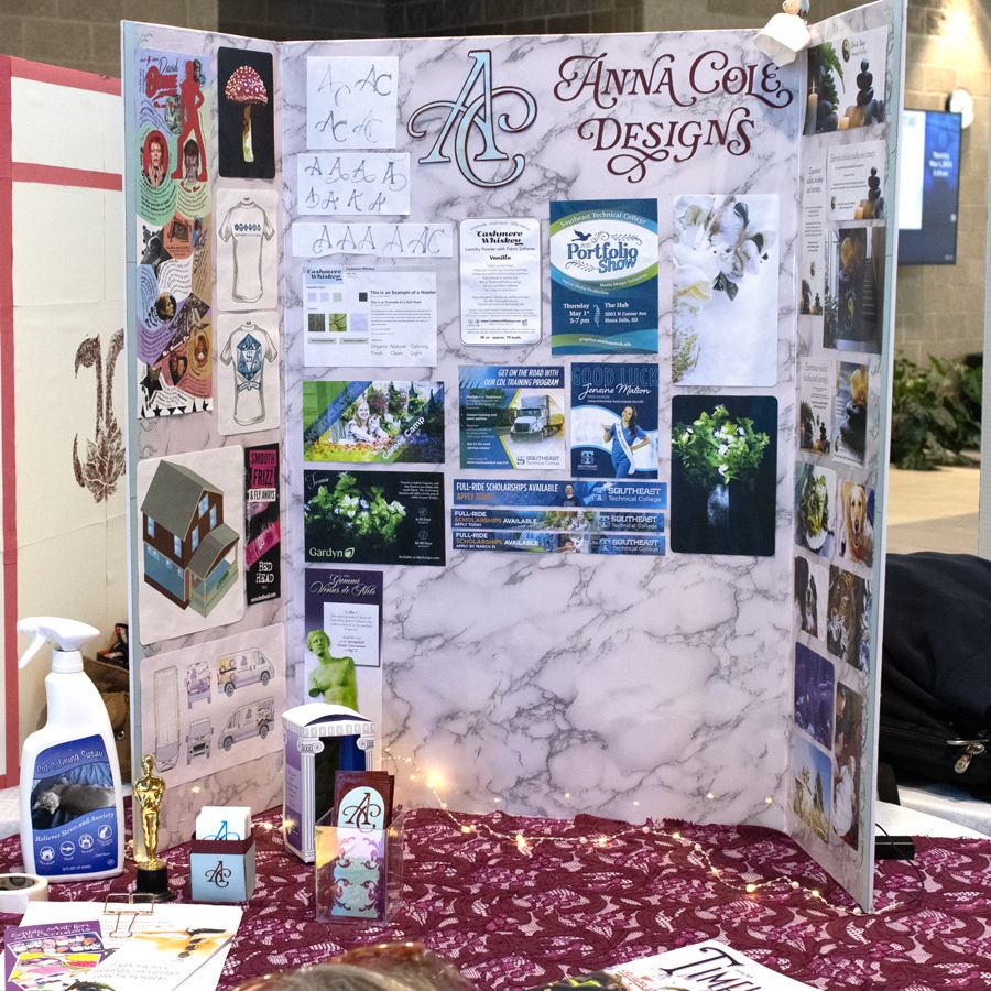
That marble contact paper on the board is one of those “Don’t overthink it” decisions– I didn’t analyze why I wanted that there when I made that decision. It’s neutral and doesn’t pull attention from the images on it, but it also has texture and isn’t generic. It says “upscale” and it reminded me of the storefronts in Soho. when I actually dig into it, there is a meaning and reason behind picking a stupidly difficult material to work with on this project.
Subconsciously, I think I was drawn to it because it reminded me of walking down Leonard St to the dance studio where I designed costumes.

It also reminds me of walking through that same neighborhood– from a rented loft in Soho turned into a Fashion Week production space temporarily to my 5th floor walkup on Orchard St– in the late night hours of January 2014 in the snow. “Quiet” isn’t normally a word people associate with Manhattan, but Lower Manhattan on winter nights at about 2am is actually silent. I was transitioning out of a grittier life as one of the core people at Occupy Wall Street to a much more glamorous life as the Great Recession eased during that time.

Some of these magazine pages feel like a bridge between my old life and my new life, a way to finally form some sense of continuity.
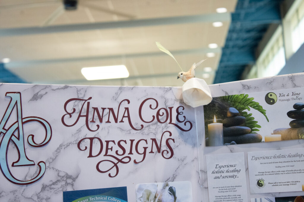
Sticking that little flower and bird on there wasn’t a decision I thought deeply about in the moment. I noticed that the board was a little damaged at the corner and wanted to cover it up, so I grabbed that flower and bird off of a side table in my living room and stuck it on there. I think little details like that are what made it stand out!
When I designed the ten piece campaign for Yin and Yang Massage Therapy, I went with the most obvious choices that came to mind quickly. Those ads were so effective that guests at the Portfolio Show were taking down the number for my massage therapist!